Claude Code for Marketers: Build Without a Developer
Claude Code is not a developer tool. It is the tool that builds the marketing automations you keep describing in chat. No developer needed.
Read articleYour WordPress theme was enforcing design consistency invisibly. When you migrate to a custom Claude Code build, that disappears. Here is how to replace it with four files.

Five sessions in, the client site I was building had three different button sizes.
The services page did not match the homepage. The brand color - a deep forest green the client had built their identity around - showed up as three slightly different hex values. One per component, depending on when Claude had generated it. Small enough to miss on a single page, but impossible to unsee once you looked at all of them together.
I was helping a small agency migrate a client site from WordPress. The WordPress theme had been handling design consistency for three years. Global styles, component patterns, spacing rules - all managed invisibly by the theme. When we moved to a custom Claude Code build, that infrastructure disappeared. Nothing was enforcing the rules anymore.
Claude was not the problem. The missing source of truth was.
The fix was not better prompting. It was four files.
A design system is not a Figma file. It is not something designers produce and developers implement.
It is four decisions, written down.
Color tokens. Not just hex values - decisions mapped to purpose. --color-primary: #1D5C3A is a hex value. --color-accent used consistently for all primary buttons is a decision. Claude applies rules, not aesthetics. When your rules say “use —color-accent for all primary buttons,” that rule holds across every page. When the rule says “use the green,” Claude interprets it differently each session.
Type scale. Two or three font sizes, not fifteen. A heading size, a body size, a caption size. Written as CSS variables. When Claude needs a size, it picks from your scale - not from whatever felt right in the moment.
Spacing scale. How far apart things sit. One base unit, with multiples. Every gap, every padding value is a multiple of that unit. Consistent visual rhythm comes from this constraint, not from careful prompting.
Breakpoints. Where mobile becomes something else. Two breakpoints cover most sites. Mobile-first means writing for the smallest screen first. Without this rule in a file, Claude writes for desktop and adds mobile as an afterthought.
These four things decide how a site looks. When they live in files Claude reads every session, every new page draws from the same source.
The format matters. Claude reads CSS custom properties, Markdown files, and plain instructions equally well. What it cannot do is guess rules from how the site looks. It needs to be told.
A tokens file. tokens.css or equivalent. Every color, font size, and spacing value as a CSS custom property.
For the agency project I set this up once, at the start. Every component Claude built after that pulled from these values.
/* Colors */
--color-bg: #F9F9F7;
--color-surface: #FFFFFF;
--color-accent: #1D5C3A;
--color-text: #1A1A1A;
--color-text-secondary: #6B7280;

/* Typography */
--font-size-heading: 2rem;
--font-size-body: 1rem;
--font-size-small: 0.875rem;

/* Spacing */
--space-sm: 0.5rem;
--space-md: 1rem;
--space-lg: 2rem;
--space-xl: 4rem;
A design rules file. DESIGN.md in your project root. Plain language rules about what each token means and when to use it. Not documentation for humans - a reference file Claude reads before every session.
## Colors
- Use --color-accent for the primary CTA button and interactive highlights only
- Use --color-surface for card backgrounds
- Never use raw hex values - always reference a token

## Layout
- Mobile-first: all styles target the smallest screen, then expand
- Two breakpoints only: 768px (tablet) and 1024px (desktop)
- Never use fixed pixel widths on elements that need to stretch

## Typography
- Headings: --font-size-heading, font-weight 700
- Body text: --font-size-body, font-weight 400
- Labels and captions: --font-size-small
A reference in your CLAUDE.md. One line tells Claude Code where to look before any UI task.
## Design
Read DESIGN.md before every UI task. Use only the tokens defined in tokens.css.
That single line means Claude reads your design rules at the start of every session. Not because you reminded it. Because the project file says to.
Most of the agency’s clients served local customers. Most local customers search on a phone - for a service, a contact, an answer they need right now.
A desktop-first layout does not fail occasionally for a local business site. It fails the visitor who is most ready to act.
Mobile-first is a rule, not a style preference. When you write it explicitly in your DESIGN.md, Claude follows it.
## Responsive Design Rules
- Write all CSS mobile-first (no media query = mobile styles)
- Use min-width media queries only (never max-width)
- Default layout: single column, full-width
- Stack elements vertically on mobile, switch to row at 768px
- Minimum touch target: 44px height on all buttons and links
Once those rules were in the file, Claude generated components that worked on a phone by default. The contact button was always reachable. The service cards stacked correctly. The forms did not require zooming.
The mobile layout breaks not because Claude does not understand responsive design. It breaks because Claude does not know your responsive rules.Your design system
tokens.css - every color, size, and spacing value as a CSS variableDESIGN.md - plain language rules for when and how to use each tokenCLAUDE.md - one line pointing Claude at your DESIGN.md before every UI taskcomponents/ - your actual components, all drawing from the same tokensThe next client project for the agency started with the same four files. The tokens were already there. The design rules carried over. Claude generated the new components and they matched. Not because I prompted more carefully. Because the source of truth was already in place.
That is what a design system does. It makes the next page consistent with every previous page - without you enforcing it manually each time.
The sites that look designed are not always made by designers. They are made by people who made a few decisions and wrote them down.
The agency was not slow because they lacked skill. They were slow because every migration from WordPress or Shopify meant rebuilding design consistency from scratch - manually, every time. Once those decisions lived in files, the work that used to take two sessions took one.
That is the real cost of moving off a platform. The theme was doing work you did not see. Now you have to do it in files. Four files replace what the theme was handling.
You get the same result when you write the system down once.
Consistency is a file structure problem, not a skill problem.Once your tokens and rules are in place, the next step is making the system self-enforcing - so every AI edit respects your rules automatically, without you checking each one. That is what the enforcement layer handles: a skill that loads your rules before each session and a hook that catches violations after every save.
This is part of the Build System - the layer that takes Claude from setup to real output that holds across sessions.
If you are migrating a client site and want to set up the design system correctly from the start, a free audit is the fastest way to see what needs to be in place.
May you build Greatness! 🍀
Michael
Moving a client site off WordPress or Shopify? We review your setup and tell you exactly what to build first.

Claude Code is not a developer tool. It is the tool that builds the marketing automations you keep describing in chat. No developer needed.
Read article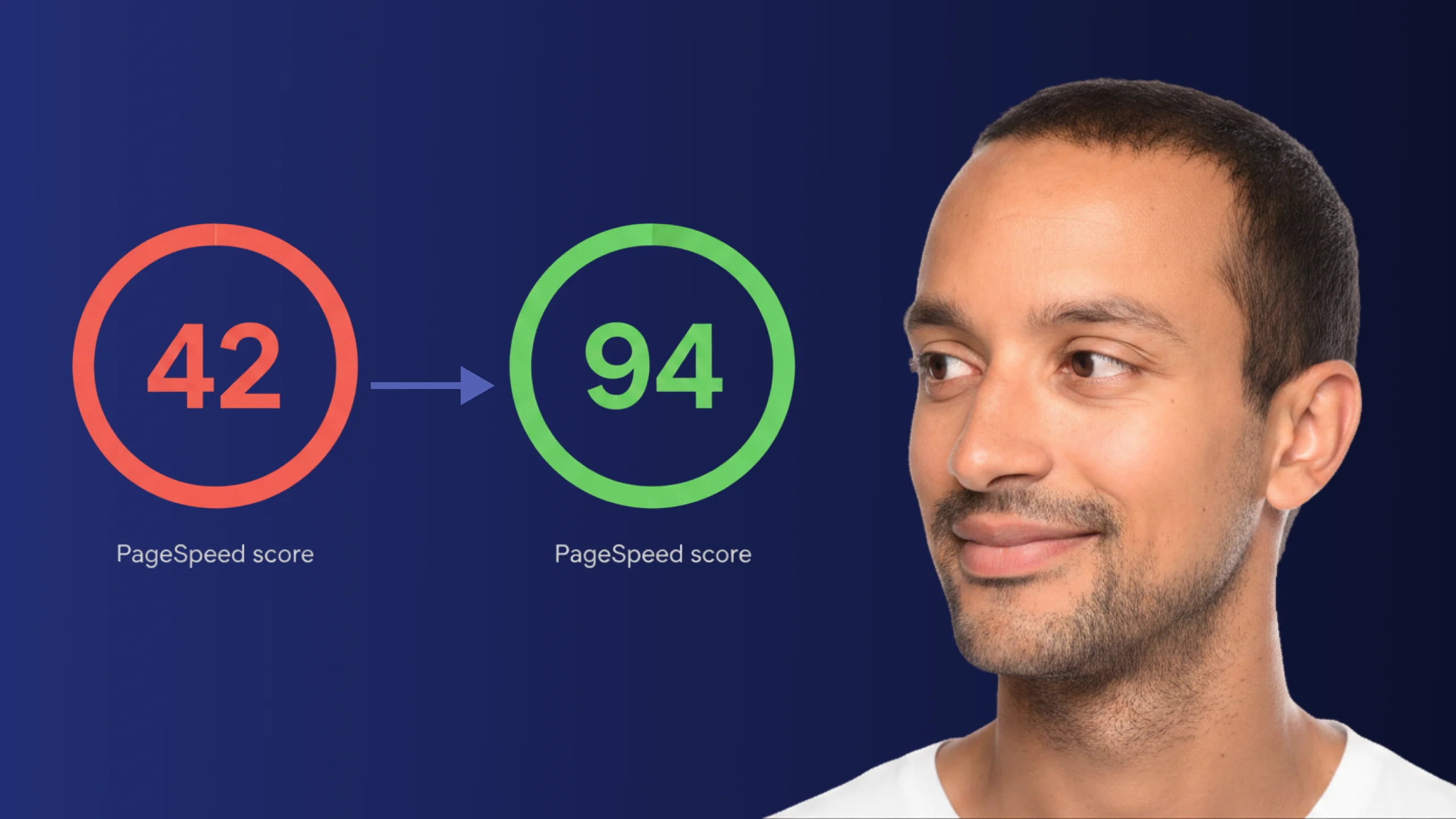
A PageSpeed score of 42 is not just slow - it is losing you real traffic on every visit. Here is exactly how Claude Code diagnosed and fixed the performance issues that moved this site from 42 to 94.
Read article
ChatGPT and Claude Code look identical at the surface. The relationship underneath is completely different - and switching without understanding that difference is where most builders get stuck.
Read article